The header area is displayed at the top of every page. It contains site-wide components like the logo, top utility menu, site navigation and search.

Top Utility Menu
The top utility menu holds links to important pages on the site. It displays the child articles of the "Top utilities article" picked in the subsite configuration. The top utilities article is normally turned off so that it doesn't appear in the site navigation and breadcrumb.
My Account Links
The items displayed in this section of the menu are the child articles of the "My Account" article picked in the subsite configuration. The "Register" article should use the Forms Service template to display a registration form, the "Login" article should use the Authentication template. You can add other articles too, like a "My Account" article for logged-in users.
Site Logo
The site logo is displayed in the top left of the header. It acts as a link to the homepage. Pick the image you would like to use in the "Site Logo" picker in the subsite configuration.
Main Menu
The child articles of the home page appear in this menu. Each menu item uses the article's best link text. If a menu item has child articles beneath it, an arrow appears to the right of the text.
Clicking the menu text or arrow causes the menu to expand, displaying links to the second and third level articles. If a menu item does not have child articles, the best link text acts as a direct link to that article. No arrow is displayed.
On the Home template this menu can either appear in the header or as a series of tabs in the page content.
Second and Third Level Menu Items

The first eight articles beneath a main menu item appear as headers in the expanded menu. The first four of their child articles appear in a list beneath them.
If a main menu article has more than eight child (second level) articles a "View All" button is shown at the bottom of the whole menu, which includes the title of the main menu item.
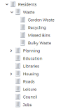
For example, the menu above is constructed like this in iCM:

The "View all Residents Sections" button appears because there are more than eight child articles ("Jobs" doesn't appear in the menu).
We recommend using the List template for your first and second level menu items (eg for the "Residents" and "Waste" articles). These lists should be set up to display all of the articles in that section of your site.
Top Search Box
At full width a magnifying glass icon appears to the right of the main menu. Clicking this icon replaces the menu with a search box. The box contains the placeholder text set in the search article.
If search suggestions are enabled, up to four content suggestions are shown once three characters have been typed into the box. This list of suggestions is updated as further characters are entered. Selecting a suggestion will take the user directly to that content.
A search will be performed using the content of the box if a user presses the enter key or clicks on the search icon.
When a user performs a search, the results are displayed on an article using the search template. Pick your site's main search article using the article picker in the subsite configuration.
For full details of the search functionality, see the Search template article.
Site Alert
Beneath the main header content an optional site alert can be displayed. If enabled this alert will appear on every page of the site.
To turn the alert on, select an article in the "Site Alert article" picker in the Subsite Settings. To turn it off, remove the article.
The alert always displays the heading of the article you've picked. If the article has summary or introductory text, this will appear below the heading, and the heading will act as a link to the full article. If the article doesn't have summary or intro text, the body text will be output (which can include inlines) and the heading won't act as a link.
Mobile Menu
At screen widths below 1024 pixels the top level menu and top utility menu are combined into a single menu icon.

Clicking the menu icon reveals the top utility and top level menu items.

These menu items act as links to their corresponding articles - there is no second and third level menu drop-down.
At screen widths which don't allow space for the search box, the search is instead displayed as a magnifying glass icon next to the menu icon. Clicking this icon reveals the search box.
The site search, including search suggestions, works as it does at full width.
Clicking the "X" icon in the top right of the menu closes it, returning the view to its previous state.


