The left column is used to display the main site navigation. The menu has two modes, full and compact. It is hidden on articles using the Home template.
The examples in this section all use the same set of articles to show the different configuration options. This is what our article tree looks like in iCM:

Side Menu
Where the screen size allows, a navigation menu is displayed in the left column. Clicking on an item in the menu takes the user to that article.
The standard navigation shows:
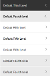
- The current page and its siblings. The title of the current page is in bold. These pages share the same colour: the "Fourth Level" items in the accompanying screenshots.
- The parent of the current page with or without its siblings. These pages share the same colour: the "Third Level" items in the accompanying screenshots.
- The grandparent of the current page with or without its siblings. The colour of these pages can be content managed: the "Top Level" items in the accompanying screenshots.
- The child articles of the current page: the "Fifth Level" pages in the accompanying screenshots.
The colours used in the menu can be content managed. Top level items use the selected colour, with each lower level getting lighter as the user browses further down the tree.
Full Menu

In this example the subsite configuration's "Show parent siblings" setting shows and hides the top, second and third level menu items that are not in the path of the article currently being viewed.
The siblings, child articles and direct ancestors of the current article are always visible.
If articles in your navigation structure are using the List template their child articles will only appear in the menu if the list article extras have "Child articles in navigation" set as "Show".
The active menu item and its ancestors have down-facing arrows. Right-facing arrows indicate that a menu item has child articles. Clicking on a menu item title navigates to that article. Clicking on an arrow opens or closes that section of the menu, showing or hiding the child menu items.
If a menu item has a hidden article (scheduled to display "no") anywhere in its ancestry, the menu will not be expanded to show the location of the current article - only the top level menu items will appear.
Compact Menu

In this example the subsite configuration's "Show parent siblings" setting shows and hides the third level menu items that are not in the path of the article currently being viewed.
The siblings and child articles of the current article are always visible, unless using the List Template.
If articles in your navigation structure are using the List Template their child articles will not appear in the navigation because this would result in duplicate links to the same content appearing in both the menu and the page content. This may mean that in some configuration, especially those using multiple levels of list articles, only the top level parent will appear in the menu.
If you are also hiding parent siblings you will find that when viewing an article that is a child of a list there will only be a single item in the navigation - the parent of the current article.
In compact mode the current article and its ancestors have left facing arrows. Other menu items have right facing arrows.
Left Navigation Colours
The colours used in the left navigation can be changed using iCM metadata and your site's skin.
The subsite configuration's "Menu style modifier property" lets you pick a metadata property. The values held in this property can be related to articles and will be output as BEM modifiers in the menu source. These can then be targeted by the site's skin to apply colours to the menu.
Metadata values will cascade down to child articles and can be overridden by relating further values at lower levels of the tree.
Mobile Menu

The mobile menu has two views to cater for the top level (simple or tabs) menu and side menu. A button at the top of the menu can be used to toggle between the two.
Section Menu
The section menu appears and behaves like the side menu of the site at full width. It allows the user to navigate around the section of the site they are currently in.
Main Menu

Should an article in the menu have child articles (ie the child articles of the active tabs described in section 1.5.2) a plus symbol appears next to the menu item. Clicking the plus expands that menu item, revealing its child items. Each child menu item is a link to the corresponding article.
Only the first two levels, that is, the top level menu items and their direct children, appear in this menu. When at a lower level of the site content users are presented with the section menu, which is the default.


